
A distribution in statistics describes how data points are spread or distributed across different values. It provides a way to understand the frequency, pattern, and overall shape of a dataset. Distributions are fundamental to statistical analysis and play a crucial role in data science, machine learning, and research.
In this guide, we will explore the concept of distributions, their types, and their importance in understanding data.
What Is a Distribution?
A distribution shows the frequency or probability of data values within a dataset. It provides insight into patterns such as central tendencies, dispersion, and anomalies.
Components of a Distribution
- Center: Measures like mean, median, and mode describe the central point.
- Spread: Variability measures like range, variance, and standard deviation describe how data is dispersed.
- Shape: Includes characteristics like symmetry, skewness, and kurtosis.
Types of Distributions
1. Uniform Distribution
In a uniform distribution, all values have equal frequency or probability.
- Example: Rolling a fair six-sided die.
- Graph: Flat and rectangular.
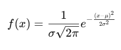
2. Normal Distribution (Gaussian)
The most common distribution, represented as a bell-shaped curve.
- Properties:
- Symmetrical around the mean.
- Mean = Median = Mode.
- Defined by mean (μ\mu) and standard deviation (σ\sigma).
- Example: Heights of individuals in a population.
Formula:
3. Skewed Distribution
- Positive Skew: Tail on the right, mean > median.
- Negative Skew: Tail on the left, mean < median.
- Example: Income distribution in a population.
4. Binomial Distribution
Describes the number of successes in a fixed number of independent trials.
- Example: Flipping a coin 10 times to count the number of heads.
Formula:
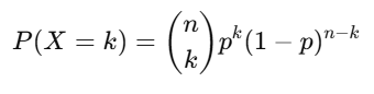
Where:
- n: Number of trials.
- p: Probability of success.
- k: Number of successes.
5. Poisson Distribution
Models the number of times an event occurs in a fixed interval of time or space.
- Example: Number of customer arrivals at a shop in an hour.
Formula:
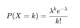
Where λ\lambda is the mean number of occurrences.
Visualizing Distributions
Visualization makes it easier to understand the shape, spread, and central tendencies of a distribution.
Common Visualization Techniques
- Histograms: Show the frequency of data within intervals.
- Box Plots: Highlight the median, quartiles, and outliers.
- Density Plots: Provide a smoothed representation of data distribution.
- Scatter Plots: Show relationships and clustering in bivariate data.
Applications of Distributions
- Business: Predicting sales patterns and customer behaviors.
- Healthcare: Modeling patient recovery times or disease outbreaks.
- Machine Learning: Selecting and evaluating models based on data distribution.
- Education: Analyzing test score distributions.
Example in Python
Here’s how to visualize a distribution using Python and Matplotlib:
import numpy as np
import matplotlib.pyplot as plt

# Generate random data with a normal distribution
data = np.random.normal(loc=50, scale=10, size=1000)

# Plot the histogram
plt.hist(data, bins=30, color='blue', alpha=0.7, edgecolor='black')
plt.title("Normal Distribution")
plt.xlabel("Value")
plt.ylabel("Frequency")
plt.show()
Key Points to Remember
- Shape matters: The shape of a distribution impacts statistical analysis and interpretation.
- Outliers: Extreme values can distort measures like the mean and standard deviation.
- Real-world relevance: Most natural phenomena follow a normal or skewed distribution.