
Welcome to The Coding College, your trusted resource for coding tutorials and programming knowledge. In today’s post, we’ll dive into Plotting Linear Functions, an essential skill in Data Science. Visualizing linear functions allows you to better understand the relationship between variables and communicate your findings effectively. Whether you’re performing exploratory data analysis or building machine learning models, plotting linear functions is a powerful tool. Let’s explore how you can plot linear functions in Python and use this technique in your Data Science projects.
What are Linear Functions?
A linear function describes a relationship between two variables where the change in one variable results in a proportional change in the other. Mathematically, the linear function can be written as:
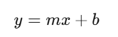
Where:
- y is the dependent variable (output).
- x is the independent variable (input).
- m is the slope, which indicates how much yy changes for a given change in xx.
- b is the y-intercept, the value of y when x = 0.
In the context of Data Science, we often use linear functions to represent relationships between variables, and plotting them can help us visualize these relationships.
Why is Plotting Linear Functions Important?
- Visual Understanding: Plotting a linear function helps you visually understand the relationship between variables, making it easier to interpret the data.
- Exploratory Data Analysis (EDA): Before diving into complex modeling, you can use linear plots to understand how features relate to the target variable.
- Model Interpretation: In machine learning, visualizing linear regression models can help you interpret the model’s coefficients and understand the influence of each feature on the outcome.
- Outlier Detection: Plotting can also help detect outliers or data points that deviate from the expected linear pattern.
How to Plot Linear Functions in Python
Python offers several libraries for plotting data, with Matplotlib and Seaborn being the most commonly used for visualizations. Let’s walk through an example of how to plot a linear function using Python.
Step 1: Install Necessary Libraries
If you haven’t already, you’ll need to install Matplotlib and NumPy. You can install them using pip:
pip install matplotlib numpyStep 2: Import Libraries and Create Data
Now, let’s import the necessary libraries and create some example data to plot.
import numpy as np
import matplotlib.pyplot as plt

# Generate data for the linear function y = 2x + 1
x = np.linspace(-10, 10, 100)  # Create 100 values between -10 and 10
y = 2 * x + 1  # Linear function with slope 2 and y-intercept 1

# Plotting the linear function
plt.plot(x, y, label='y = 2x + 1', color='blue')  # Line plot
plt.xlabel('x')  # Label for x-axis
plt.ylabel('y')  # Label for y-axis
plt.title('Plotting the Linear Function y = 2x + 1')  # Title of the plot
plt.grid(True)  # Show grid for better visibility
plt.axhline(0, color='black',linewidth=1)  # Horizontal line at y=0
plt.axvline(0, color='black',linewidth=1)  # Vertical line at x=0
plt.legend()  # Show legend
plt.show()  # Display the plot
In this code:
- We use NumPy to create a set of x-values ranging from -10 to 10.
- We then calculate the corresponding y-values using the equation of the linear function y=2x+1y = 2x + 1.
- Finally, we plot the function using Matplotlib.
Step 3: Customize the Plot
You can customize your plot by adjusting various elements such as the line style, color, grid, labels, and title. Below are some options you can use to enhance your plot.
plt.plot(x, y, label='y = 2x + 1', linestyle='-', color='green', linewidth=2)
plt.scatter(x, y, color='red') # Add scatter points- Line Style: Use
linestyle='--'for dashed lines,'-'for solid lines, etc. - Line Color: You can change the color to any valid color name or hex code.
- Scatter Points: You can also add individual data points to the plot using
scatter().
Plotting Linear Regression in Data Science
In Data Science, linear functions are often used in linear regression, a technique used to model the relationship between a dependent variable and one or more independent variables. After training a linear regression model, you can plot the regression line to visualize how well the model fits the data.
Here’s how you can plot a linear regression line using scikit-learn:
Example: Linear Regression with Plot
import numpy as np
import pandas as pd
import matplotlib.pyplot as plt
from sklearn.linear_model import LinearRegression

# Example dataset
data = {'Experience': [1, 2, 3, 4, 5, 6, 7, 8, 9, 10],
        'Salary': [40000, 45000, 50000, 55000, 60000, 65000, 70000, 75000, 80000, 85000]}
df = pd.DataFrame(data)

# Prepare data for linear regression
X = df[['Experience']]  # Independent variable
y = df['Salary']  # Dependent variable

# Create and fit the model
model = LinearRegression()
model.fit(X, y)

# Predict salary values using the linear regression model
y_pred = model.predict(X)

# Plot data points and regression line
plt.scatter(X, y, color='blue', label='Data points')
plt.plot(X, y_pred, color='red', label='Regression line')
plt.xlabel('Experience')
plt.ylabel('Salary')
plt.title('Linear Regression: Salary vs Experience')
plt.legend()
plt.show()
In this example, we perform linear regression using the LinearRegression model from scikit-learn, then plot the regression line along with the data points. This visualizes how well the linear regression model fits the data.
Best Practices for Plotting Linear Functions
- Choose the Right Range: Ensure that the range of the x-values makes sense for your data. Too narrow or too broad a range can distort the plot and make it hard to interpret.
- Label Axes Clearly: Always label the axes to provide context for the data being plotted. This helps viewers understand what the x and y variables represent.
- Use Gridlines: Adding gridlines helps readers easily interpret the values on the graph.
- Title the Plot: A descriptive title can help users quickly understand what the plot is about.
- Visualize the Data and Model: When performing linear regression, always plot both the data points and the regression line to better assess the model fit.
Conclusion
Plotting Linear Functions is a fundamental skill in Data Science that helps you visualize relationships between variables, interpret model results, and present your findings effectively. Whether you are exploring data or building machine learning models, visualizing linear functions is an essential part of the process.
At The Coding College, we are dedicated to providing high-quality tutorials and resources to help you master the fundamentals of Data Science and Machine Learning. Stay tuned for more tutorials and guides on how to improve your data science skills.